
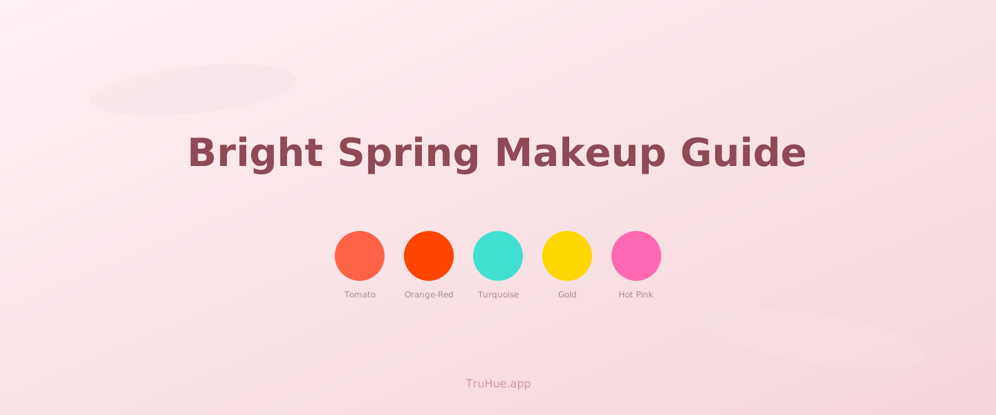
You're a Bright Spring — warm undertone, high chroma, high contrast. Your palette runs on vivid, saturated warmth: punchy corals, warm reds, golden bronzes, and turquoise accents. When the color is right, you look lit from within. When it's wrong, you look washed out or muddy.
This guide breaks down what works for Bright Spring across every makeup category — and what to leave on the shelf.
Quick Answer
Both are warm-toned Spring seasons, but Bright Spring has higher contrast and higher chroma.
→ Score any product for your season — free
What Makes Bright Spring Different
Bright Spring combines three attributes: warm undertone, high chroma (vivid, saturated color), and high contrast (noticeable difference between your skin, hair, and eyes). That combination means you need warmth and intensity together. Warm but muted? Too flat. Bright but cool? Wrong direction. You need both dials turned up.
Not sure which season you are?
Take the free color analysis quiz — 2 minutes, no email required. Then every product in this post gets scored for your palette.
Take the Free QuizThis is what separates Bright Spring from Light Spring. Light Spring shares your warmth but at lower contrast and softer chroma — pastels, gentle peaches, delicate warmth. Bright Spring needs the volume up. A coral that's right for Light Spring might read as barely-there on you.
FREE DOWNLOAD
Free Bright Spring Cheat Sheet
Your Bright Spring palette on one page — colors, product picks, and what to avoid. Download it, screenshot it, keep it in your bag.
No spam. Unsubscribe anytime.
Lips: Warm, Vivid, Unapologetic
Your lip colors live in the warm-bright zone: vivid coral, warm red (tomato red, poppy red — no blue undertone), bright peach, and warm pink (think watermelon, not bubblegum). A warm red lip on a Bright Spring looks effortless and alive — the kind of red that makes people ask what shade it is.
Not sure of your season yet? Take the free color quiz — it takes about 2 minutes.
Your free 12-season color guide is ready
30 pages of palettes, product picks, and styling tips — matched to your season. Delivered straight to your inbox.
No spam. Just your free guide.
What to skip: cool mauves, dusty roses, grey-toned nudes, blue-based reds, and anything labeled "berry" or "plum" that pulls cool. These fight your warmth and drain the natural vibrancy from your face. If a lipstick makes you look tired despite being a pretty shade, the undertone is probably wrong.
Cheeks: Golden Warmth, Real Pigment
Bright Spring blush colors include warm peach, bright coral, warm apricot, and golden pink. You can handle pigmented blush — don't be afraid of shades that look intense in the pan. On your skin, they read as a healthy, sun-warmed flush.
Bronzer is actually your friend. Golden bronze and warm caramel bronzers work beautifully on Bright Spring — they enhance your natural warmth instead of fighting it. This is one area where you and True Winter have completely opposite palettes. Their bronzer disaster is your everyday glow.
Eyes: Clear, Warm, and Bold
Your eye palette thrives on warm gold, copper, warm bronze, turquoise, bright teal, and warm peach. Shimmer works well on Bright Spring eyes — warm metallics catch light in a way that matches your high-contrast coloring. A gold shimmer lid with warm brown in the crease is a reliable go-to.
What to avoid: cool greys, silver, dusty mauves, cool taupe, and heavy charcoal. Matte cool-toned smoky eyes — the ones that look editorial on True Winter — will dull your natural warmth. If you want drama, go deep in warm tones (deep copper, warm espresso, dark teal) instead of dark in cool tones.
Your Sister Seasons: Light Spring and True Spring
Light Spring shares your warm undertone but at lower contrast and softer saturation. Light Spring colors will read as too quiet on you — wearable (OKAY), but not as vibrant as you could go. If you see a product scored YAY for Light Spring and OKAY for Bright Spring, it's likely too muted for your palette.
True Spring shares your warmth and much of your chroma, sitting right next to you in the Spring family. Many products will score YAY for both seasons. Where they differ: Bright Spring has higher contrast and can handle slightly more saturated, slightly cooler-warm shades (like turquoise) that True Spring might not pull off as naturally.
How TruHue Scores for Bright Spring
TruHue's scoring engine checks every product's undertone, depth, chroma, and contrast against your Bright Spring palette. Over 40,000+ products across 735 brands are already scored and ready to search. You see YAY, OKAY, or NAY — no guessing, no squinting at swatches under store lighting.
Search a product by name, scan a barcode at the store, or browse your YAY-scored feed by category. Your pocket color expert does the color science — you just pick the shade you like.
Frequently Asked Questions
What is the difference between Bright Spring and Light Spring?
Both are warm-toned Spring seasons, but Bright Spring has higher contrast and higher chroma. Light Spring is softer and more delicate — pastels, peach, and warm ivory. Bright Spring needs more saturated, vivid versions of those same warm tones. A coral that's right for Light Spring might look washed-out on Bright Spring.
Can Bright Spring wear coral or peach?
Yes — coral and peach are core Bright Spring shades. The key is saturation: Bright Spring wears vivid, punchy corals and warm peaches, not dusty or muted versions. If it looks bright and warm on the swatch, it's likely a YAY.
What colors should Bright Spring avoid?
Dusty, muted, and heavily cool tones clash with Bright Spring. Cool mauves, grey-toned pinks, ashy browns, and dark heavy shades like black eyeliner or charcoal shadow will dull your natural brightness. Look for warm, clear, saturated alternatives instead.
Want to try these products?
Shop on Amazon →TruHue may earn a small commission at no extra cost to you.
Want to find your color season yourself?
The self-guided course walks you through it — 7 modules, 18 draping exercises, printable swatch set. $24.99, instant download.
See the Course →Keep exploring
- The Bright Spring colour palette, scored
- Can True Spring wear pink lipstick?
- How AI color analysis works
- Undertone, depth, chroma, and contrast explained
- How to check any product in-store
- Seasonal color analysis (Wikipedia) (external)
- True Spring vs Bright Spring: Side-by-Side
- Score any product for your season — free, instant (tool)
- Best Lipstick for Bright Spring
- Best Blush for Bright Spring
- Best Eyeshadow for Bright Spring
- Best Bronzer for Bright Spring
Find out if these products work for you
Your color season determines which shades score YAY, OKAY, or NAY. Take the free quiz and see your personalized scores.
Find My SeasonShop the products in this post
Some links in this post are affiliate links. When you shop through them, TruHue earns a small commission at no cost to you — it’s how we keep the app free.
Take TruHue Shopping With You
Scan any barcode in the store and see your YAY, OKAY, or NAY score before you buy. Free on the App Store.
Download the App →Score any product for Bright Spring
Search by name or scan a barcode. Your YAY/OKAY/NAY score shows up instantly.
Try It FreeGet Bright Spring picks in your inbox
Product recommendations, trend breakdowns scored for your palette, and seasonal guides.